Creative Brief:
Our Company is called E2(squared) Therapeutics. We are a start up medical device company with a groundbreaking technology for chronic wound infections. We have a new way to deliver an antimicrobial to the wound so that it penetrates the area and destroys the infection. For Diabetic patients suffering from chronic wound worldwide this is good news , because these infections can lead to amputation.
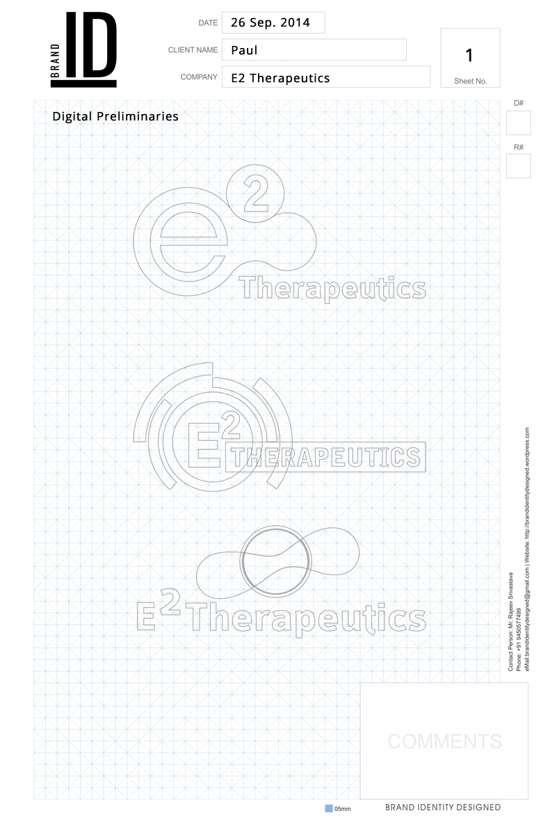
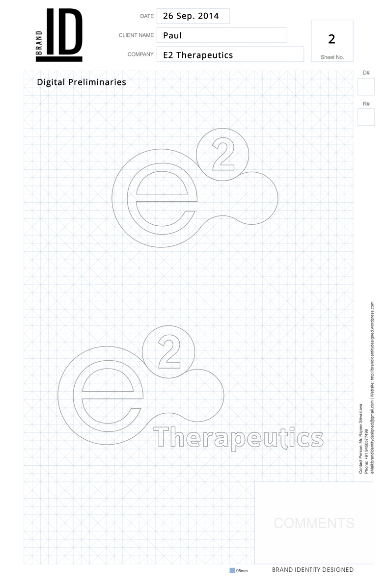
We would like the logo to be a visual representation of who we are. We are innovators, we fearlessly design new treatments so that patients can live full lives, we love what what we do.
A good example of a company that is in our space is http://www.novantherapeutics.com
A key advantage we have in our delivery system is that it results in getting bacteria below the surface, thus delivering a more complete treatment.
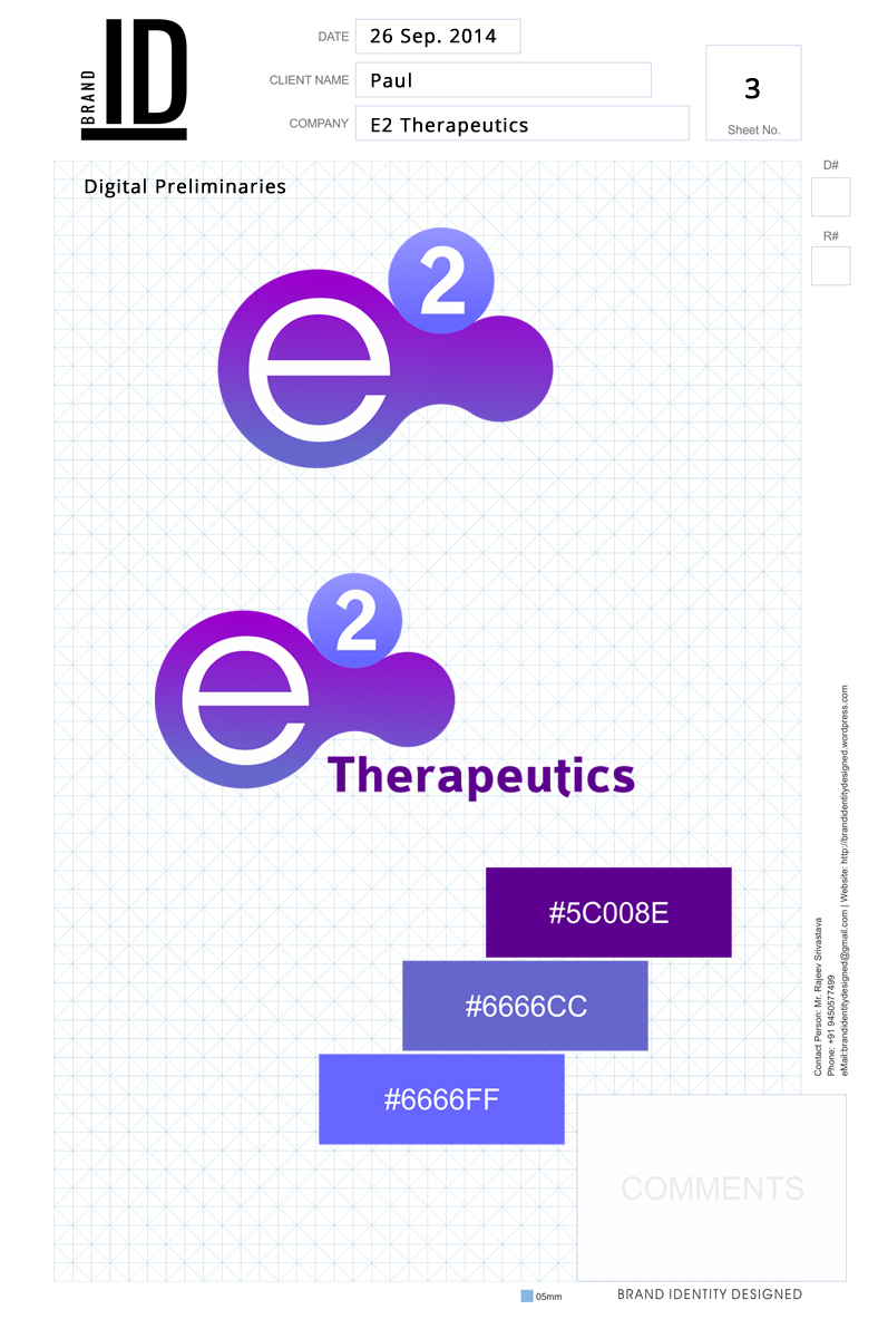
Form a color scheme standpoint, we would rather you pick something that is vibrant, and not “scientific and boring” . Our risk tolerance on this is medium (Hot pink will not work for our older scientists)
The logo should be on a clear background so that when it appears in presentations, it does not have a block of white, or a block of black on top of the background color.
There was some confusion so I’ve asked to client:
“What are the possible ways to write your company? is it “E2(squared) Therapeutics” OR “E2 Therapeutics”.
What is the significance of “squared”?
Do you wants to write E2 like mathematics x2? I think… I understand your point but just wants to clear.”
Reply:
Yes E2 is squared like the mathematics, so it should be super-set
The significance is we combined two types of electric energy applications to get a multiplier effect. In that our company’s technology is energy based, so energy describes us well. Our energy radiates the treatment into the patient.


